A well-designed cosmetics menu does more than list products or services; it guides customers through a beauty brand’s world, explains value quickly, and encourages confident purchasing decisions. Whether the menu appears in a salon, spa, boutique, pop-up counter, or ecommerce product guide, its layout can shape how customers perceive quality, expertise, and style.
TLDR: A cosmetics menu should be visually clear, brand-aligned, and easy to scan. Strong layouts use organized categories, strategic spacing, elegant typography, and product imagery to help customers understand options quickly. Beauty brands benefit from highlighting bestsellers, bundles, premium services, and seasonal offers without overcrowding the design. The best menus feel both practical and aspirational, making the customer journey smoother and more enjoyable.
Why Cosmetics Menu Design Matters
In the beauty industry, presentation is part of the experience. A cosmetics menu must reflect the same care and polish as the products or services it promotes. When customers review makeup collections, skincare treatments, lash services, fragrance lines, or cosmetic packages, they are often making decisions based on visual appeal, trust, and clarity.
A cluttered menu can make even a premium brand feel confusing or outdated. A clean and thoughtfully structured menu, however, can communicate professionalism, luxury, accessibility, or creativity within seconds. The layout tells customers where to look first, which products are most important, and what kind of experience the brand offers.
For beauty brands, cosmetics menus may appear in several formats, including printed brochures, spa service cards, salon price lists, retail counter displays, social media menus, digital catalogs, and website product pages. Each format demands a slightly different layout, but the core design principles remain the same: readability, hierarchy, consistency, and emotional appeal.
Start With a Clear Visual Hierarchy
A cosmetics menu should never force customers to search for basic information. A strong visual hierarchy helps the eye move naturally from the most important details to supporting information. This may include brand name, category title, product or service name, short description, price, and callout labels such as new, bestseller, or limited edition.
Designers often create hierarchy through size, weight, spacing, and placement. For example, category headings may appear in large serif lettering, while product descriptions use smaller sans serif text. Prices can be aligned consistently on the right side or placed beneath each item for a more editorial look.
- Primary level: Brand name, menu title, or main category.
- Secondary level: Product names, treatment names, package titles, or collection names.
- Third level: Descriptions, ingredients, service timing, benefits, and prices.
- Accent level: Labels, icons, promotional tags, and customer favorites.
When hierarchy is clear, customers can compare options faster and feel less overwhelmed. This is especially important for brands with extensive product lines or multiple treatment combinations.
Use Categories That Reflect Customer Needs
Beauty menus work best when organized around how customers think. Instead of simply listing everything in inventory order, brands can group items by goal, concern, occasion, or routine. This makes the menu feel helpful rather than transactional.
For skincare brands, categories might include Hydration, Brightening, Anti Aging, Acne Care, and Sensitive Skin. For makeup brands, sections might include Face, Eyes, Lips, Complexion Sets, and Bridal Looks. For salons or spas, menus can be divided into Signature Facials, Lash Services, Brow Styling, Makeup Applications, and Beauty Packages.
Benefit-led categories are particularly effective because they connect products to desired outcomes. A customer may not know which serum to choose, but a section titled Glow Boosters or Barrier Repair Essentials immediately suggests a result.
Choose a Layout Style That Matches the Brand Personality
Every beauty brand has a visual personality, and the menu layout should support it. A luxury skincare clinic may use wide margins, muted colors, minimal text, and refined typography. A playful cosmetics brand may prefer bright colors, rounded shapes, stickers, icons, and energetic product names. A natural beauty brand might use earthy tones, botanical illustrations, and soft textures.
Minimalist Layout
A minimalist menu uses generous white space, limited color, and concise copy. This layout is ideal for upscale skincare, clean beauty, fragrance, or clinical cosmetic brands. The design should avoid unnecessary decoration and allow the products or services to feel premium.
Editorial Layout
An editorial layout resembles a magazine spread. It may include large product images, mood-driven sections, quotes, ingredient highlights, and feature blocks. This style works well for beauty brands that rely heavily on storytelling and lifestyle appeal.
Grid-Based Layout
A grid layout is practical for menus with many products. Items can be arranged in cards, columns, or rows, making comparison easy. It is useful for retail price lists, ecommerce category menus, and product catalogs.
Luxury Service Menu Layout
For spas, salons, and cosmetic studios, a luxury service menu often includes treatment duration, price, benefits, and recommended add-ons. The layout should make upgrades feel natural, such as pairing a facial with an eye treatment or a makeup application with lash styling.
Balance Product Descriptions With White Space
Cosmetics menus often need to include important information such as ingredients, skin type, finish, shade range, treatment time, and expected results. However, too much copy can make the design feel heavy. The most effective menus use short descriptions that focus on benefits rather than exhaustive technical details.
For example, instead of writing a long paragraph about a moisturizer, a menu might say: Lightweight daily cream with ceramides and hyaluronic acid for soft, hydrated skin. This communicates the key value quickly.
White space is not empty space; it is a design tool. It separates sections, improves readability, and gives the brand a more polished identity. Premium cosmetics menus often use spacing to make each product feel carefully selected rather than crowded into a list.
Highlight Bestsellers and Signature Offers
Many customers appreciate guidance. Labels such as Bestseller, Staff Pick, Signature Treatment, or Most Loved can help direct attention toward proven choices. These highlights are especially useful for first-time customers who may feel unsure about where to begin.
Signature offers should receive visual emphasis without disrupting the overall layout. A menu might feature a boxed section for a hero facial, a ribbon label next to a cult-favorite lipstick, or a shaded background behind a seasonal bundle.
- Hero product block: Ideal for promoting a flagship serum, palette, fragrance, or treatment.
- Bundle panel: Useful for skincare routines, bridal packages, or holiday gift sets.
- Comparison row: Helpful for showing differences between basic, deluxe, and premium services.
- Icon labels: Effective for vegan, cruelty free, fragrance free, refillable, or dermatologist tested products.
Make Pricing Easy to Understand
Pricing should be clear and consistent. If customers struggle to find prices or understand package differences, they may hesitate to purchase. A cosmetics menu should align prices neatly and avoid visual clutter around cost information.
For service-based beauty businesses, it helps to include duration alongside price. For example, a facial menu may list 45 minutes, 60 minutes, and 90 minutes options. For product menus, brands can include size, shade count, refill availability, or set value.
Tiered pricing can also be presented elegantly. A makeup studio might list Soft Glam, Full Glam, and Bridal Glam as three columns, each with included features. A skincare brand might offer Starter Routine, Complete Routine, and Professional Routine bundles.
Use Color With Intention
Color plays a powerful role in cosmetics menu design. It can suggest mood, category, skin concern, product type, or seasonal theme. Soft neutrals may communicate calm and sophistication, while coral, lilac, rose, and champagne tones often feel feminine and beauty-focused. Black and gold can suggest luxury, while green and beige may support natural or botanical positioning.
However, too many colors can weaken the brand identity. A strong menu usually relies on a core palette with one or two accent colors. These accents can be used for section dividers, callout labels, icons, or promotional messages.
Color coding may also improve navigation. A skincare menu might use blue for hydration, green for calming, pink for radiance, and gold for anti-aging. The key is consistency; once a color represents a category, it should remain consistent throughout the menu.
Select Typography That Feels Beautiful and Readable
Typography can instantly change how a cosmetics menu feels. A delicate serif font may suggest elegance, while a clean sans serif feels modern and clinical. Script fonts can add romance or artistry, but they should be used sparingly because they may reduce readability.
Most beauty menus benefit from pairing two typefaces: one display font for headings and one readable font for descriptions. Font size should be large enough for comfortable reading, especially for printed menus in salons, spas, or retail environments.
Important details such as prices, service times, and product names should never be too small. If a menu is designed for mobile viewing, typography must be tested on a phone screen to ensure it remains legible.
Add Imagery Without Overcrowding the Page
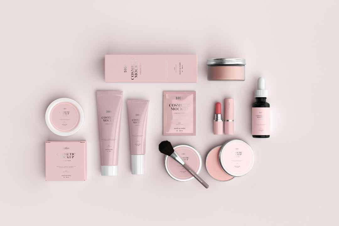
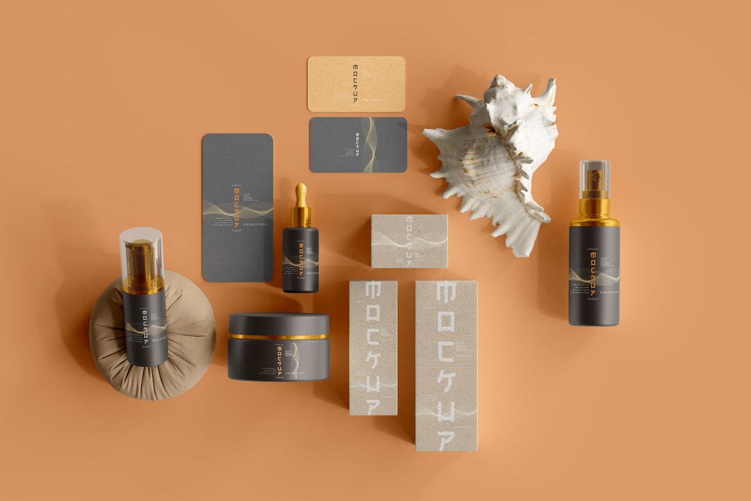
Images can elevate a cosmetics menu by showing textures, packaging, shades, models, or treatment experiences. For makeup brands, swatches and product close-ups are especially valuable. For skincare brands, images of cream textures, ingredients, or glowing skin can reinforce product benefits. For service menus, calm treatment room photography can build trust and set expectations.
Still, imagery should support the layout rather than dominate it. One large hero image may create more impact than many small, competing photos. Product cards can include small images when customers need visual reference, but service menus often look more refined with fewer, larger visuals.

Design for Print and Digital Use
Cosmetics menus often need to work across multiple channels. A printed menu may sit on a vanity counter, treatment bed, retail shelf, or consultation table. A digital menu may appear on a website, booking page, social media story, email campaign, or tablet display.
Print menus need strong contrast, proper margins, and high-resolution visuals. They should also consider paper texture and finish. Matte paper may feel modern and soft, while glossy finishes can enhance color and product photography.
Digital menus should be easy to scroll and tap. Mobile users should not need to zoom in to read descriptions or prices. Buttons, category links, and booking prompts should be placed logically. A digital menu can also include expandable descriptions, shade filters, or routine recommendations to reduce clutter.
Include Trust-Building Details
Beauty purchases often involve personal concerns, such as skin sensitivity, ingredient preferences, hygiene, or desired results. A cosmetics menu can build trust by including small but meaningful details. These may include product certifications, allergy notes, consultation recommendations, patch test reminders, or professional credentials.
For example, a lash menu may mention when a patch test is required. A skincare menu may point out fragrance-free options. A makeup menu may indicate long-wear, waterproof, or photography-friendly finishes. These details help customers choose confidently and reduce uncertainty.
Layout Ideas for Different Beauty Brand Types
- Skincare clinic: Use calm colors, clinical spacing, treatment categories, benefit descriptions, and clear durations.
- Makeup artist: Feature look-based packages, before-and-after imagery, bridal sections, and add-on services.
- Cosmetics retailer: Use product grids, shade families, bestseller tags, and seasonal collection panels.
- Natural beauty brand: Include ingredient highlights, botanical visuals, sustainability icons, and gentle earthy palettes.
- Luxury spa: Use refined typography, spacious layouts, premium paper textures, and elegant package descriptions.
Common Mistakes to Avoid
Even attractive cosmetics menus can fail if they are difficult to use. The most common mistakes include overcrowding, inconsistent alignment, vague descriptions, hidden prices, and too many decorative elements. A menu should never sacrifice clarity for style.
Another mistake is using trend-driven design without considering long-term brand identity. Beauty trends change quickly, but a strong menu should remain recognizable and useful beyond a single season. Seasonal inserts or promotional cards can refresh the design without requiring a complete redesign.
Final Thoughts
A cosmetics menu is both a sales tool and a brand experience. Its layout should make products and services easy to understand while expressing the unique mood of the beauty brand. With clear categories, thoughtful hierarchy, elegant typography, strategic imagery, and consistent pricing, a menu can help customers feel inspired rather than overwhelmed.
When designed well, the menu becomes more than a list. It becomes a guided beauty journey that supports discovery, confidence, and stronger customer connection.
FAQ
What should a cosmetics menu include?
A cosmetics menu should include product or service categories, names, short descriptions, prices, and any important details such as size, duration, skin type, finish, ingredients, or add-ons. It may also include bestseller labels, package options, and booking or purchase prompts.
What is the best layout for a beauty service menu?
The best layout is usually category-based, with clear service names, benefits, treatment times, and prices. Signature services or premium packages can be highlighted in a separate box or featured section.
How can a cosmetics menu look more luxurious?
A luxurious menu often uses generous white space, refined typography, muted colors, high-quality imagery, and minimal clutter. Consistent alignment and concise descriptions also help create a premium feel.
Should prices be included on a cosmetics menu?
In most cases, prices should be included because clear pricing builds trust and helps customers make decisions. If prices vary, the menu can use starting prices or consultation-based notes.
How often should a beauty brand update its menu?
A beauty brand should review its menu whenever products, prices, services, or promotions change. Many brands update seasonally while keeping the core layout consistent for brand recognition.