

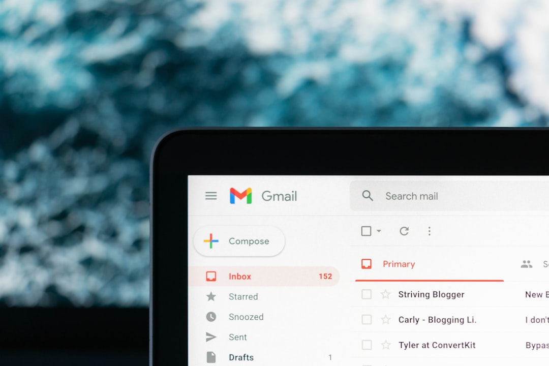
A newsletter footer may sit at the bottom of an email, but it plays a surprisingly important role in how subscribers experience your brand. It is where legal requirements, trust signals, navigation, preferences, and final conversion opportunities all come together. A strong footer makes your email feel complete, professional, and easy to act on.
TLDR: A good newsletter footer should be clear, compliant, useful, and consistent with your brand. Include essentials such as an unsubscribe link, mailing address, contact details, social links, and preference options. Keep the design simple, mobile-friendly, and easy to scan. The best footers reduce friction while giving subscribers more control over their relationship with your emails.
Why the Newsletter Footer Matters
Many marketers focus heavily on subject lines, hero images, and calls to action, then treat the footer as an afterthought. That is a mistake. The footer is often where subscribers look when they want to manage preferences, verify your legitimacy, find support, or reconnect with your website and social channels.
A polished footer can also improve trust. When readers see a real business address, clear contact information, and an easy unsubscribe option, your email feels more transparent. In contrast, a vague or cluttered footer can make even a beautifully designed newsletter seem unprofessional.
1. Include the Required Legal Information
Every newsletter footer should include the information required by email regulations in your region. While rules vary by country, most commercial emails need to show who sent the message, where the sender is located, and how recipients can opt out.
Common legal footer elements include:
- Your company name or organization name
- A physical mailing address, such as an office, registered address, or postal box where allowed
- An unsubscribe link that is easy to find and simple to use
- Reason for receiving the email, such as “You are receiving this because you subscribed to our weekly newsletter”
Example: You are receiving this email because you signed up for updates from Green Table Studio. Green Table Studio, 42 Market Street, Austin, TX. Unsubscribe or update your preferences at any time.
This type of copy is short, direct, and helpful. It avoids sounding defensive while still covering the basics subscribers expect.
2. Make the Unsubscribe Link Clear
Hiding the unsubscribe link is never a good strategy. If people cannot easily opt out, they may mark your email as spam instead, which can damage sender reputation and deliverability. A visible unsubscribe link shows respect for the reader and keeps your list healthier.
Place the unsubscribe link in a predictable location, usually near the bottom of the footer. Use plain wording such as “Unsubscribe”, “Manage email preferences”, or “Update your subscription”. Avoid manipulative phrases like “Are you sure you want to abandon us?” because they create unnecessary friction.
Better example: No longer want these emails? You can unsubscribe here, or update your preferences to receive fewer messages.
This approach gives people options. Some subscribers may not want to leave completely; they may simply want monthly updates instead of weekly emails.
3. Add Preference Management
A preference center is one of the most useful footer features. Instead of forcing subscribers to choose between receiving everything or unsubscribing entirely, it lets them customize what they receive.
You might allow subscribers to choose:
- Email frequency, such as daily, weekly, or monthly
- Topics of interest, such as product updates, events, guides, or offers
- Preferred location or language
- Whether they receive promotional emails, educational content, or both
Example: Want fewer emails? Manage your preferences and choose the updates that matter most to you.
This small footer addition can improve retention because it gives subscribers control. It also helps you send more relevant campaigns, which can increase engagement over time.
4. Keep the Design Clean and Scannable
A newsletter footer does not need to be visually boring, but it should be easy to scan. Use a clear hierarchy, enough spacing, and readable font sizes. Avoid cramming every possible link into a dense block of tiny text.
Good footer design usually includes:
- Short sections with clear labels
- Readable contrast between text and background
- Mobile-friendly spacing so links are easy to tap
- Minimal clutter with only the most important links
For example, a retailer might divide the footer into three simple rows: social media icons, customer links, and legal information. A nonprofit might use the footer to show donation links, volunteer information, and contact details. The key is to organize based on what your audience is likely to need next.
5. Include Contact and Support Links
Your footer is a natural place to help readers reach you. This is especially important for ecommerce brands, service providers, event organizers, and membership-based communities. If a subscriber has a question, they should not have to search your entire website to find support.
Useful contact links may include:
- Customer support email
- Help center or FAQ page
- Contact form
- Store locator
- Live chat page
Example: Need help with your order? Visit our Help Center or contact our support team.
This type of footer copy is practical and reassuring. It tells subscribers that your business is accessible and prepared to help.
6. Add Social Media Links Carefully
Social media icons are common in newsletter footers, and they can be useful when included thoughtfully. They give readers another way to follow your brand, see timely updates, or join a community. However, adding too many icons can make the footer feel noisy.
Choose the platforms where your brand is genuinely active. If your audience is engaged on Instagram and LinkedIn, include those. If you have not posted on a platform in two years, leave it out. A smaller set of relevant links is more effective than a long row of inactive channels.
Example: Follow us for behind the scenes updates, new releases, and community stories.
7. Reinforce Your Brand Voice
The footer may be functional, but it can still sound like your brand. A financial services company may keep the tone formal and concise. A lifestyle brand may be warmer and more conversational. A creative studio may add a playful signoff.
Compare these examples:
- Professional: You are receiving this message because you subscribed to company updates from Northline Advisory.
- Friendly: You are on this list because you asked us to send helpful ideas, news, and occasional offers.
- Playful: You signed up, we sent the good stuff, and you can update your preferences anytime.
All three communicate the same basic information, but each creates a different impression. Consistency matters. Your footer should feel like a natural extension of the rest of your email.
8. Use the Footer for Secondary Calls to Action
Your main call to action belongs higher in the newsletter, but the footer can support secondary actions. These are lower-pressure links that help interested readers explore further.
Possible footer calls to action include:
- Read the blog
- Shop new arrivals
- Refer a friend
- Download the app
- Join the community
The best secondary calls to action are relevant but not overwhelming. If your footer already includes legal text, contact links, social icons, and preferences, choose only one or two promotional links.
Image not found in postmeta9. Test Footer Links and Mobile Display
A footer is only useful if everything works. Before sending a newsletter, test every link, especially unsubscribe and preference links. Also preview the email on mobile devices. Footer links often appear close together, and small text can become difficult to tap on a phone.
A simple testing checklist includes:
- Does the unsubscribe link work?
- Does the preference center open correctly?
- Are social links going to the right profiles?
- Is the mailing address accurate?
- Is the text readable on mobile?
- Are links spaced far enough apart for easy tapping?
Newsletter Footer Examples by Use Case
Ecommerce footer: Include customer support, returns, shipping, store locator, social links, unsubscribe, and preferences. This helps shoppers quickly find service information.
SaaS footer: Include product documentation, support, system status, community, company address, and subscription settings. This is useful for users who may need technical help.
Nonprofit footer: Include donation links, volunteer opportunities, impact reports, contact information, social channels, and unsubscribe. The footer can reinforce credibility and mission.
Creator newsletter footer: Include a short personal note, social links, archive link, referral link, and unsubscribe option. A human, simple footer often works best for independent publishers.
Final Thoughts
A great newsletter footer balances compliance, usability, and brand personality. It should tell subscribers who you are, why they are receiving your email, how to contact you, and how to control their subscription. When designed well, the footer does more than close the message; it builds trust, reduces frustration, and creates useful pathways for continued engagement.
Treat your footer as a permanent part of the reader experience, not a leftover space. Keep it clean, keep it honest, and make every link earn its place.