
As users interact more frequently with technology, their expectations for meaningful, efficient, and enjoyable interfaces continue to rise. While major design decisions such as layout and color schemes hold obvious importance, it’s often the subtle details—those tiny prompts and responses we barely notice—that shape how users feel about a product. These are called micro-interactions, and when executed correctly, they enhance usability without ever calling attention to themselves.
What Are Micro-Interactions?
Micro-interactions are the small, contained product moments that serve one main task. Think about liking a photo on social media, adjusting a setting toggle, or receiving a confirmation checkmark after submitting a form. These little experiences are everywhere in digital interfaces and play an essential role in providing feedback, guiding tasks, or helping the user avoid errors.
Originally championed by designer Dan Saffer, micro-interactions consist of four parts:
- Trigger: The moment the interaction begins.
- Rules: What can or cannot be done during said interaction.
- Feedback: How the interface responds to the interaction.
- Loops and Modes: How the interaction changes over time or in certain circumstances.
But with the infinite palette presented by animation engines and design tools, it’s easy to get carried away. A loading spinner that whirls too long, a flamboyant transition, or a fancy hover effect can quickly cross the line from supportive to outright distracting. The sweet spot lies in crafting micro-interactions that clarify function—not draw attention away from it.
The Purpose: Clarification Over Spectacle
The role of a successful micro-interaction is to reinforce what just happened or what’s about to happen. Done well, these interactions make products feel intuitive and responsive. They should never become elements that waste time, consume attention, or confuse users.
Ask yourself: does this tooltip animation help the user understand, or is it eye candy? Does this error shake motion on a form reinforce the idea of a failed submission, or is it just mimicry of a mobile app trend?
Let’s examine the characteristics of micro-interactions that bring clarity to user flows, supported by practical examples.
Key Characteristics of Helpful Micro-Interactions
1. Immediate, Relevant Feedback
Imagine clicking a button to “Save Settings.” Instead of redirecting or leaving users guessing whether the action was successful, a subtle checkmark animation or a green confirmation message fades in next to the button.
This moment is brief—maybe less than a second—but it quickly informs users that their action worked. Importantly, it doesn’t steal attention from the broader task or interfere with navigation.
Example: A real-time email validation field: once the user inputs a valid format, a small green icon appears, signaling correctness. This spares users from pressing “Submit” only to be told about mistakes afterward.
2. Context Sensitive
Micro-interactions thrive on understanding the context in which they appear. A loading animation during a heavy task like image upload might justify a more visible spinner, but the same level of animation when toggling between tabs might feel excessive.
Progress indicators, adaptive tooltips, and subtle highlight transitions ensure users stay informed without feeling interrupted. Context-sensitive behavior avoids mismatched reactions that could confuse or disorient the user.
3. Non-Intrusive Animations
Animating visual elements can provide helpful directional cues. For instance, sliding a drawer menu in from the left instantly tells the user where that content resides spatially. But how it moves matters—smooth, minimal motion is usually more effective than jarring or elastic movements.
Tip: Keep durations short—under 300 milliseconds is often ideal for most UI animations. Anything longer may feel sluggish and distract from the task at hand.
4. Accessibility Awareness
Elegant accessibility doesn’t exclude micro-interactions. Instead, thoughtful design ensures that users relying on screen readers, keyboard navigation, or color contrast receive equivalent feedback. For example, instead of only showing a red border to signal an input error, also include a concise error message that screen readers can detect.
Micro-interactions should enhance clarity for all users.
Practical Examples That Clarify
1. Inline Field Validations
When a form input dynamically flags an incorrect entry (like a password that doesn’t meet criteria), it immediately saves the user time and confusion. Even better if done through micro-interactions: the red color transition, the shake animation, or inline hint text gently appears without hijacking focus.
2. Button States
- Hover: A slight color change signals the button is interactive.
- Pressed: A subtle depress animation mimics tactile response.
- Disabled: Muted colors and a tooltip explaining why the action is unavailable.
These may feel minor, but they drastically improve conceptual clarity and usability.
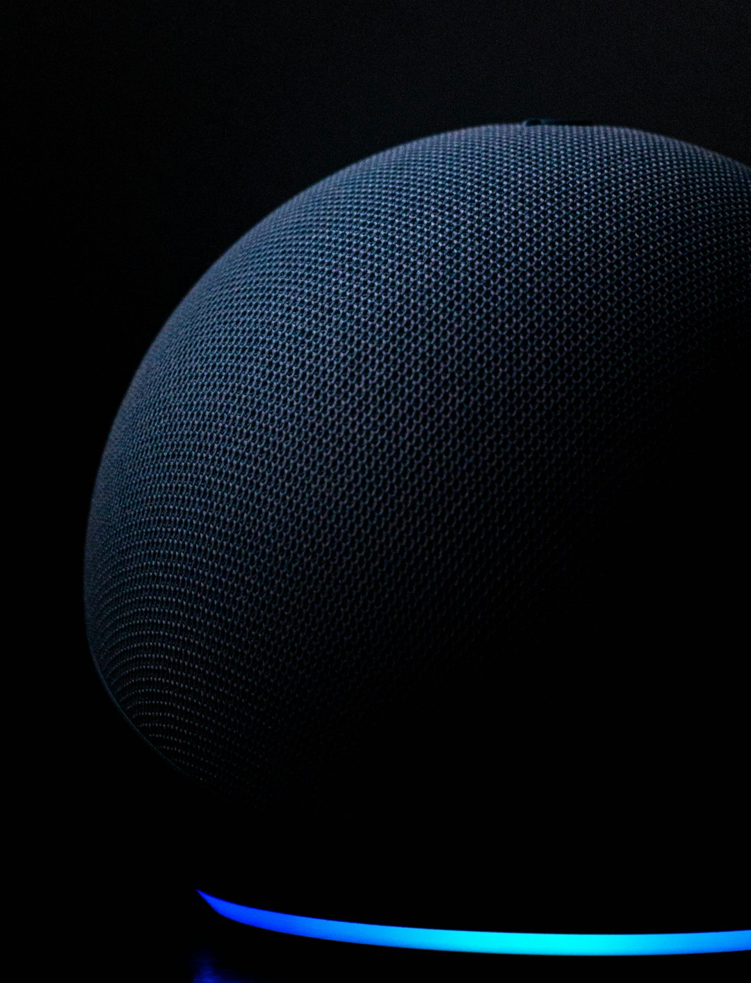
3. Voice Feedback in Smart Interfaces
In voice user interfaces (VUI), micro-interactions don’t come in the form of visuals—it’s about tones, beeps, and subtle pauses. When Alexa glows blue to indicate it’s listening or when your phone vibrates softly to confirm voice capture, those are micro-interactions too—designed to clarify, not distract.
4. Notification Badges
“1” in a red dot—simple, effective, and universally recognizable. As long as it’s used prudently and cleared upon use, this is among the clearest micro-interactions in modern design.
Balancing Subtlety and Purpose
Adding micro-interactions isn’t about checking boxes, but matching motion or reaction with intent. It’s easy to fall into the pitfall of animated excess—collapse menus that take too long, hover effects that induce vertigo, or swipe gestures that involve confusing acrobatics.
The goal isn’t to decorate the experience, but to amplify understanding. Users shouldn’t think, “Well, that’s a cool animation”—they should simply know what’s going on.
Designing with Micro-Interactions in Mind
When building or improving a product, don’t wait until the end to consider micro-interactions. Make them part of your design framework from the beginning. Here are a few steps:
- Map key user actions—Define where feedback is essential to prevent user hesitation.
- Prioritize clarity—Ask if each animation helps the user better comprehend what’s happening.
- Test for accessibility—Ensure your micro-interactions aren’t leaving anyone behind.
Final Thought
If macro design sets the stage for your product’s user experience, micro-interactions are the spotlights that guide the journey. When used strategically, they highlight success, warn about danger, and connect users with your interface in a subtle, almost invisible way.
The best micro-interactions are like good manners: you barely notice them—but greatly appreciate their presence. In an age of shrinking attention spans and rising expectations, reducing friction through clarification-focused micro-interactions is not just good UX—it’s smart product design.