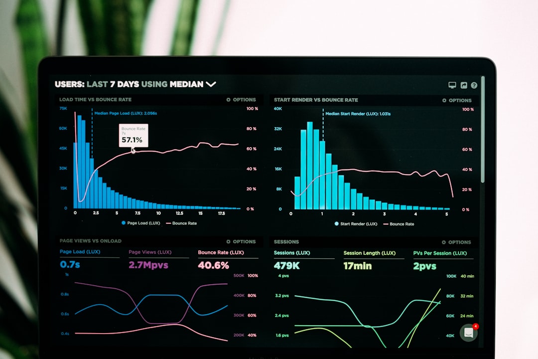
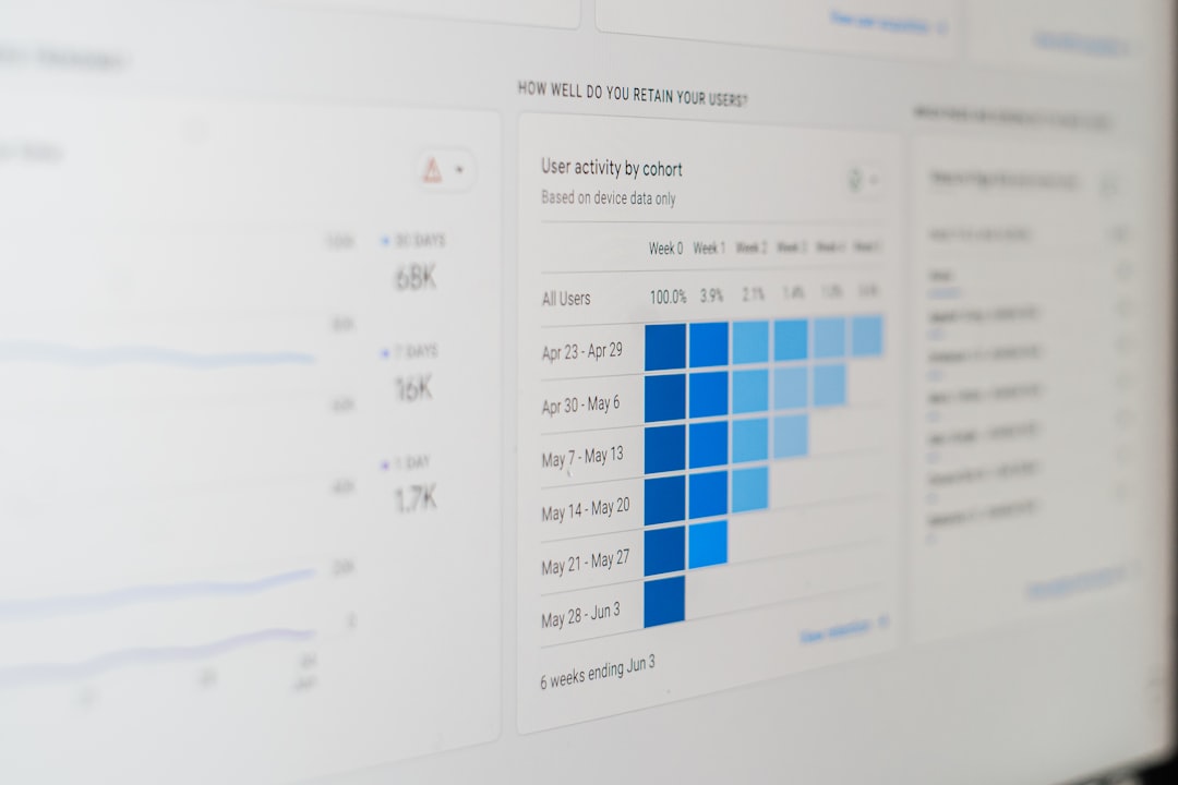
In an increasingly data-driven world, visualizations play a crucial role in interpreting complex information. From academic research and journalism to UX design and business analytics, data visualizations are used everywhere. However, for these visuals to be truly effective, they must be accessible to everyone, including people with visual, cognitive, and motor impairments. Accessibility in data visualization isn’t just good practice — in many contexts, it’s a legal and ethical imperative.
Designers often focus on aesthetics and information density, but they may overlook critical aspects such as color contrast, labeling clarity, and effects like motion or animation. In this article, we unpack three major pillars of accessible data visualization: color, labels, and motion. Each of these elements can either enhance or hinder the accessibility of a visual presentation depending on how they’re implemented.
Color: More Than Just a Palette
Color is one of the most commonly used dimensions in data visualization. It can be used to differentiate categories, show numerical values, or highlight specific trends. But color perception isn’t universal — and that’s where many visualizations fall short.
Colorblindness and Contrast
Roughly 1 in 12 men and 1 in 200 women have some form of color vision deficiency (CVD), with red-green colorblindness being the most common. When visualizations rely solely on color to convey differences, they become unusable for many individuals.
- Use contrasting hues and brightness levels: Don’t rely just on red and green — include differences in lightness and saturation to help users with colorblindness distinguish between categories.
- Test visualizations using simulators: Tools like Color Oracle or online checkers can simulate how your visualization looks to users with different types of CVD.
- Always accompany color with a second indicator: Patterns, shapes, or labels can serve as redundant cues, improving clarity for all users.
Web Content Accessibility Guidelines (WCAG) recommend a contrast ratio of at least 4.5:1 for normal text and 3:1 for large text. These same principles apply to text within visualizations like data labels, axis titles, and legends.

Labels: The Unsung Heroes of Clarity
Clear and consistent labeling may not be flashy, but it dramatically improves understanding — especially for users with cognitive impairments or those using screen readers. Labels aren’t just a courtesy; they ensure that your data story is readable, regardless of a person’s abilities.
Best Practices for Labeling
- Label data directly when possible: Instead of relying heavily on legends, placing text labels immediately next to data points (bars, lines, etc.) reduces the cognitive load of scanning back and forth.
- Use descriptive axis titles: Avoid jargon or abbreviations. “Revenue Over Time” is clearer than “Rev/Time.”
- Make fonts legible: Use simple sans-serif fonts like Arial or Helvetica, and size them appropriately. A minimum of 12pt is a good rule of thumb for on-screen viewing.
- Readable spacing: Avoid overlapping labels, dense clusters of text, or extremely tight line spacing. These design flaws particularly disadvantage users with dyslexia or visual tracking difficulties.
Another vital consideration is ensuring that your labels make sense when accessed using assistive technologies. For example, adding descriptive aria-labels or alt text when visualizations are embedded as images helps screen reader users navigate the visuals.
Motion and Animation: Powerful, Yet Potentially Problematic
Motion can greatly enhance storytelling in data visualizations. Animations that transition between charts or illustrate trends over time can engage users and emphasize patterns. However, overuse or poorly implemented motion can cause problems — particularly for users with vestibular disorders or attention-related impairments.
Use Motion With Care
- Keep animations short and purposeful: Transitions of more than 400ms can become distracting.
- Provide pause or skip options: If motion is automatically triggered or loops endlessly, users should be able to stop it as needed.
- Respect user preferences: The CSS property
prefers-reduced-motioncan detect if a user has asked for minimal animation in their OS settings. Data visualizations should honor this setting by default. - Avoid flashing content: Sudden, high-contrast flashes can trigger seizures in susceptible individuals. Stick to smooth, subtle animations.
When used responsibly, motion can add value. For example, animating the growth of a line chart over time can help users visually grasp trends. However, it’s critical not to rely solely on motion to convey essential information, especially when static alternatives could communicate the same message effectively.

Combining Elements for Universal Design
While we’ve explored color, labels, and motion as individual components, the goal of accessible design is to bring them together cohesively. Achieving a balance between clarity, usability, and inclusivity often requires iteration and testing with a diverse user base. It’s also wise to apply universal design principles that make visualizations better for everyone — not just for people with diagnosed impairments.
Tips for Holistic Accessible Visual Design
- Provide alternative formats: Offer downloadable CSVs or HTML tables alongside your charts to accommodate screen reader users.
- Use captions and descriptions: Summarize the insight you want users to glean from the chart in accompanying text.
- Favor interactivity mindfully: While hover-over tooltips can enrich user experience, they’re often hard to navigate on mobile or with screen readers. Make such content accessible with keyboard controls or tap-friendly elements.
Inclusive design doesn’t mean compromising on creativity. Rather, it forces us to be more thoughtful in our execution. Often, accessible visualizations end up being more understandable and more beautiful — less cluttered, more focused, and more user-friendly.
Tools and Resources
Numerous tools can help you assess and improve the accessibility of your visualizations:
- Color Contrast Analyzers: Tools like WebAIM’s contrast checker can ensure your visuals meet WCAG standards.
- Accessible Chart Libraries: Libraries like
D3.js,Plotly, andHighchartsprovide accessibility-focused APIs and features. - Screen Reader Testing: NVDA for Windows and VoiceOver for macOS are freely available for designers to test how screen readers interact with their content.
Keep learning by exploring communities and guidelines like the W3C Accessibility Initiative, which provides in-depth guides and use cases for making all web content—including data visualizations—more inclusive.
Final Thoughts
Accessible data visualizations are not only a requirement in many cases but also a sign of thoughtful, user-centered design. By paying close attention to color usage, investing in effective labeling, and using motion responsibly, we can help ensure that no one is left behind in the age of information.
Accessibility is not a feature — it’s a foundation. As we build tools and experiences that interpret the world through data, let’s commit to making them readable, navigable, and usable for all.


